Thursday 5th January 2023
Over the past two decades, stocks with a price-to-earnings ratio of less than 30x have represented about 80% of all stocks with a market cap over $1bn. It is for this reason that about 80% of stocks that generate five-year compounded returns of over 10% have been stocks that started out with a P/E ratio less than 30x.
That is, if we are looking for stocks that will generate returns of 10% or more per year high P/E stocks are just as good a hunting ground as low P/E stocks. It is just that there are more low P/E stocks in the initial population so they feature more frequently in the output.
In Exhibit 1 below we can see the distribution of US stocks by P/E multiple between 1999 and 2017. The tiny proportion of stocks with a P/E ratio 30x and over are shown in white.
Exhibit 1: Stocks with a P/E ratio less than 30x have consistently represented ~80% of the total
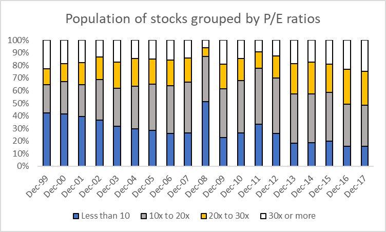
Source: The Equity Analyst
The value in evaluating these P/E ratios through to 2017 is that we can now evaluate if these low-P/E stocks were able to generate higher market capitalisation gains over the subsequent five years – that is to say, if these low-P/E stocks were “cheaper” or better investments.
Looking at the subset of stocks that generated compounded annual gains of over 10% over five years, I looked to see if the stocks that started out with a low-P/E ratio represented a higher proportion of this group relative to their share in the overall population.
Interestingly, as can be seen in Exhibit 2 below, while the majority of the high returning stocks started out with a P/E ratio of less than 30x, their share in this group is smaller than that in the starting population (~80%, Exhibit 1) .
Exhibit 2: Low P/E stocks don’t generate their fair share of high returns
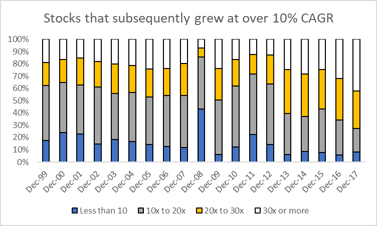
Source: The Equity Analyst
But more interesting is the fact that, since 2002, stocks with a P/E above 30x have consistently represented a disproportionately large share of high return stocks.
That is to say, for example, that while only 25% of stocks in Dec-17 had a P/E ratio of 30x or more (Exhibit 1), 42% of the stocks from 2017 that grew at over 10% CAGR subsequently started with a P/E of 30x and over (Exhibit 2).
In general, this can be seen by comparing the size of the white bars in Exhibit 2 to those in Exhibit 1 – the white bars in Exhibit 2 are almost always bigger. I have put these side-by-side in Exhibit 3, below.
Exhibit 3: Stocks with a P/E > 30x represent a disproportionately high share of 10%+ CAGR returns
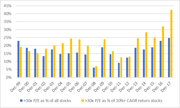
Source: The Equity Analyst
One way to read the graph above is to think of the blue bars as representing the number of stocks that have a P/E ratio of above 30x. So in 2008, for example, during the Global Financial Crisis, only about 6% of stocks were trading with a P/E ratio of above 30x. Therefore, it makes sense that of all the stocks that went on to generate 10%+ CAGR returns from 2008 onwards, the ones that started with a 30x multiple made up a small share – about 7% (orange bar in 2008).
To recap, we’ve established that:
- Stocks with a P/E multiple of 30x or more usually represent about 20% of all stocks (Exhibit 1)
- Of all the stocks that will go on to generate returns of over 10% per year for the next 5 years, those starting with a P/E ratio of 30x will represent a greater share of that sample than they did in the starting population of stocks (Exhibit 3).
Suppose we were to solely look at
